BritishTypography
Just our type and a font of knowledge

Before we get into the history of British typography. Let's have some context.
Letters and words fill our world. On every street corner, in every book and newspaper and on every side of every lorry. Letters and words communicate to us. They tell us where we should be going, how we should think and even how we should feel. But it is the design of the fonts that gives us the meaning and the take out of the letters and words. Fonts are their soul.
If a STOP sign is written in Comic Sans would we take it seriously? Would we chuckle as we nonchalantly trundled past without a care in the world. Only to be clattered by an oncoming lorry. This is the power of type design. Communicating with everyone who sets their eyes on it.
But how has British typography and British type designers played their part in this world of letters and numbers?
The story starts with a German. Johannes Gutenburg who in 1446 started experimenting with what we now know as the printing press and by 1450 he had a working prototype. Although Gutenburg created a moveable type printing press, he cannot claim to have invented it. As the Chinese had moveable woodblock type presses as far back as 868. And ceramic moveable presses around 1040. Whilst metal moveable type setting presses were developed in Korea in 12th Century.
Anyway, back to Gutenburg. He democratised the printing press at least. He partnered with Johan Fust and they began to print bibles in 1455. All were pre-sold. Letting the hoi polloi devour the bible for themselves. Which led to all sorts of problems that Gutenburg could never have imagined. The split of the church being one. When in 1517 Martin Luther printed multiple copies of his Ninety-Five thesis. And so the Protestant reformation lit a fuse that is explosive today as it was back then.
Then along came William Caxton, he bought the printing press to England in 1476. Not only did he become a master printer, arguably the best of his time but also the first retailer of printed works and books. He was probably The Godfather of British typography.
That first press was in Westminster. Where he printed the first copies of the Bible in English, Chaucer’s The Canterbury Tales and Aesop’s Fables. He is acknowledged as the man who did most to standardise English as printed works needed to be as standardised as possible. He had many headaches on the spelling of certain words because of the dialects all over Britain. Just think how a Geordie sounds compared to a Bristolian. And through his time in Bruges, we now spell ghost with a silent H because of its Flemish influence.
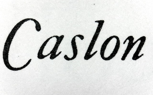
Caxton used only eight typefaces, which although modified through the centuries are still widely available. They are called, unsurprisingly, ‘Caxton’ and for identifying purposes Type 1, Type 2 and so on and so forth. His typefaces were generally taken from the low countries where Caxton had lived. There was obviously no English style yet as Caxton was the first to bring printing to Britain.
Then came the first true English typeface. That honour goes to Caslon, William Caslon to be exact. His works were influenced by the Dutch. He was an engraver by trade and a real craftsman and when he set his mind to creating a typeface people marvelled at its elegance and beautiful proportions. Caslon was truly the father of English typography and created a foundry in 1737 that stayed in the family for over 120 years. He was a craftsman of exquisite dedication. The Caslon typeface still survives today. It has been scrutinised, enhanced and bastardised by many other type designers. The US Declaration of Independence was set in Caslon and even in the 20th Century there were signs hanging in print shops in the States and beyond that declared ‘When in doubt, use Caslon’.
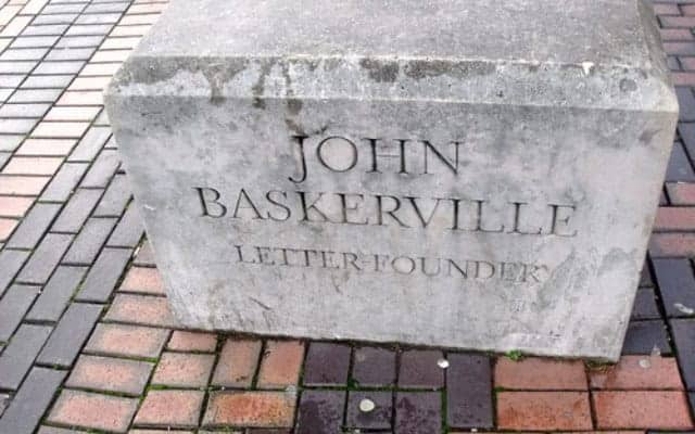
A contemporary of Caslon was John Baskerville. His typefaces received criticism in England as not being as good as Caslon but throughout Europe he was hailed as a master, influencing Bodoni and Didot. When he died in 1775 his wife carried on his foundry for a while but eventually his wife sold his punches to a French foundry, as once again they were rejected by any English foundry. From his foundry in Birmingham he believed that he could perfect type. Making the definition between thin and thick lines, sharpening the serifs and making curves more ovular. But as already mention this was too radical for the English. The Baskerville type still survives on many computers like Monotype’s Baskerville or Baskerville Old Type. And the Canadian Government still use Baskerville.
Although he was not the most successful printer or type designer of his day, he had two famous fans. Franklin Benjamin (who began life as a printer) who wrote Baskerville an amusing letter praising him for his magnificent artistry and scolding a man who dared to complain about Baskerville’s typefaces, that they were 'too hard to read and gave him a pain in the head', mockingly calling the gentleman a ‘connoisseur’. And Arthur Conan Doyle supposedly named Hounds of the Baskerville after him. And at Sir Gordon Bennett we use Baskerville on our printed material to honour him too.
In 1885 Robert Besley upped the game when it came to typefaces. And gained intellectual property for his Clarendon typeface. It was designed in London at the Fann Street Foundry but gained fame throughout the Wild West as the typeface used on the majority of Wanted posters. It was never designed to be a reading font, with its slab faced serif but more for display. It is still used by many brands today. Incidentally Besley went on to become the Sheriff of the City of London and also the Lord Mayor of London.
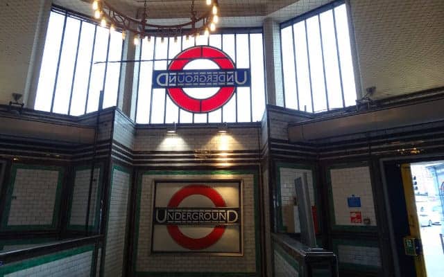
The Johnstone Typeface hailed in the modernist world. Sans serif was new and also abhorred. The reason it is sometimes called grotesque is because many thought it just so. Clipping the wings off typefaces was radical. Edward Johnstone wasn’t the first to create a sans serif but in the public’s eye he made a stand. Creating the London Underground typeface that was in use until it was redesigned in the 1980’s. He also created the iconic Roundal London Underground symbol that guides use to the Tube.
Johnstone taught many pupils but his most famous or infamous must be Eric Gill (he had a very dubious life which we will not go into here). Gill was a sculpture who turned type designer. He developed the Gill Sans in 1926, which is sometimes called the Helvetica of England. His modernist sans typeface was an instant hit. The London and North East railways chose Gill Sans for all of its promotional and timetable materials. It has been used by the BBC, the Church and Penguin Books. And not forgetting the KEEP CALM AND CARRY ON posters that have flourished on social media. Making it almost the establishment of British typography. Legibility with a touch of drama are what define Gill Sans as a classic. And why we at Sir Gordon Bennett also use Gill Sans.
Only a few years later in 1932 did a new font appear that still causes as much discussion about typefaces as any other. That workhorse is Times New Roman. Ubiquitous, staid and some would say down right lacklustre. First designed by Stanly Morison. The British advisor to the Monotype Corporation who supervised Victor Lardent, an advertising artist for the Times, whence the name derived from. Morison said that William Morris might have said it was bigoted, narrow, mean and puritan. Rather harsh for something that can’t defend itself. But it quickly gained traction as a British typeface that served its purpose. That of delivering a message without any interruptions. You read what was said not what the font was saying. Morison was an interesting character. A conscientious objector who was imprisoned during WW1. He also declined the invitation to have a CBE bestowed upon him and a Knighthood.
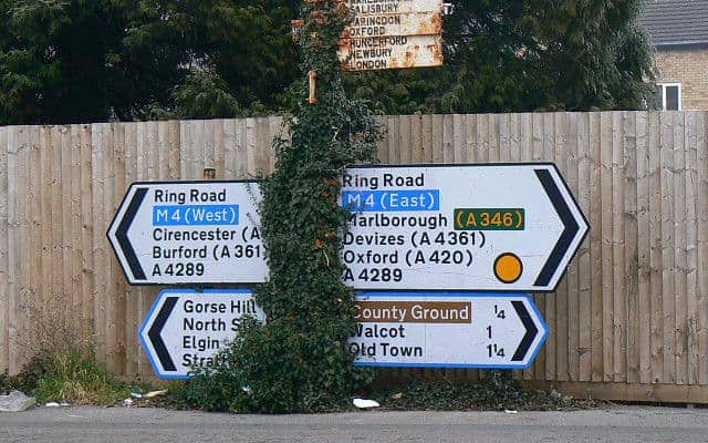
If there is one British typeface that has changed how we read by across the globe, it is Transport. Designed by Jock Kinneir and Margret Calvert. Transport typeface is now used across the Commonwealth. And Hong Kong, most of the Middle East, Iceland, Ireland, Portugal and Greece. Other variations are used in Denmark, Spain and Italy. But what makes it so good? Well, previously in Britain all road signs were in capital letters. Then the Worboys Commission with Kinneir and Calvert as advisors dissected, examined and tested road signs from across the world. What they found was that most were highly ineffective at displaying information at high speeds. The resultant Transport and Motorway fonts solved this problem with aplomb.
Which brings us into the modern era. An era where graphic design and typography collide. A world where Neville Brody explodes onto the scene. Heavily influenced by Dadaism from the 1920s. It still felt new and daring. A creator of 16 fonts, although none as ubiquitous as his British predecessors his style has influenced a generation of type designers and graphic designers. Never one for commercialism. His provocative style soon caught on with advertisers and brands who wanted to express a more rebellious and modern side. Whilst working on The Face he changed the game, causing many in the field to rethink the magazine as a medium. He blurred the line between graphic design and typography and is often called the ‘Star Typographer’.
Brody’s type is there to be noticed. To grab you by the eyeballs and scream at you. Whereas the fonts of say Kinneir and Calvert are there to be read, to not be noticed, apart from the word itself.
The world would be a very different place without the skill, craftsmanship and vision of many British type designers from Caslon through to Gill and Brody. What the future holds in this digital world is anyone’s guess but you can be sure a British typographer will have a say in it somehow.
The 'mechanical' or 'digital' typeface has made the world a more legible place and at Sir Gordon Bennett we love fonts and letterpress but we should also never forget the personalisation of handwriting. Below you will find a selection of AJOTO pens that will do justice to your own handwriting.

